"Mastering CSS Flexbox: A Comprehensive Guide to Creating Dynamic Layouts"


CSS Flexbox is a layout module that provides a more efficient way to align and distribute space among items in a container. It consists of a parent element (the "flex container") and its child elements (the "flex items").
Some key features of CSS Flexbox include:
Flex container: The parent element that contains one or more flex items.
Flex items: The child elements of the flex container that are arranged in a row or column.
Flex Direction: Determines the direction of the main axis of the flex container. It can be set to row (the default) or column.
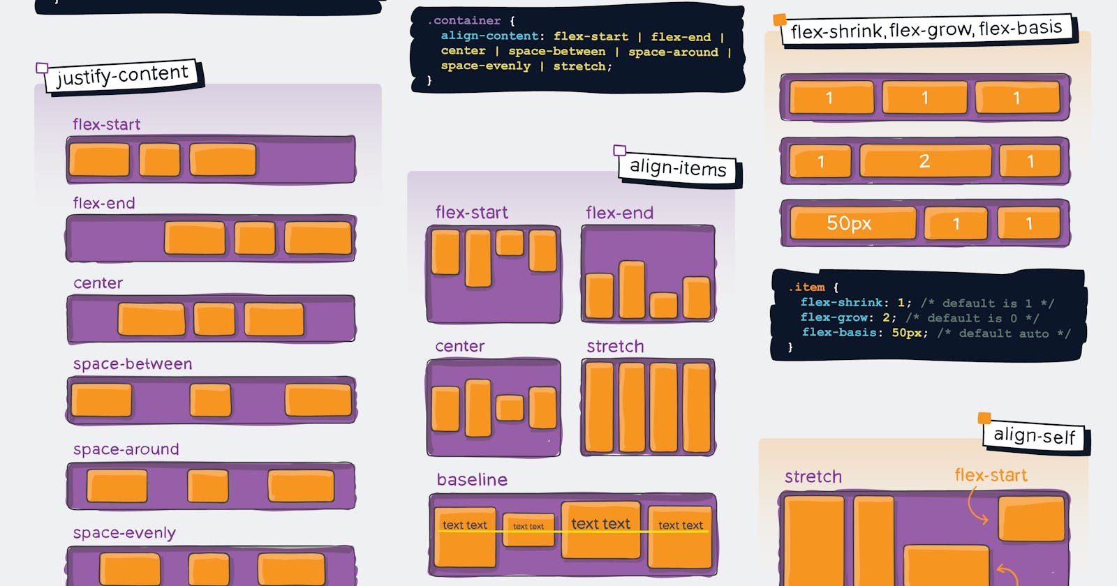
Justify content: Defines how the flex items are distributed along the main axis of the flex container. It can be set to flex-start, flex-end, center, space-between, or space-around.
Align items: Defines how the flex items are aligned along the cross-axis of the flex container. It can be set to stretch (the default), flex-start, flex-end, center, or baseline.
Flex-wrap: Defines whether the flex items should wrap onto multiple lines or not. It can be set to wrap (the default), wrap, or wrap-reverse.
Flex grow and flex-shrink: Determines how much a flex item should grow or shrink relative to the other flex items in the flex container.
Example:
cssCopy code.flex-container {
  display: flex;
  flex-direction: row;
  justify-content: space-between;
  align-items: center;
}

.flex-item {
  flex-grow: 1;
  flex-shrink: 1;
}
Centering Content Horizontally and Vertically
To center content both horizontally and vertically in a flex container, you can use the justify-content and align-items properties, both set to center. Here's an example:
cssCopy code.container {
  display: flex;
  justify-content: center;
  align-items: center;
}
Creating a Navigation Bar with Flexbox
To create a navigation bar with Flexbox, you can set the display property of the container to flex, and then use the flex-grow property on the navigation items to make them fill up the available space. Here's an example:
htmlCopy code<nav class="container">
  <a class="nav-item" href="#">Home</a>
  <a class="nav-item" href="#">About</a>
  <a class="nav-item" href="#">Contact</a>
</nav>
cssCopy code.container {
  display: flex;
  justify-content: space-between;
  align-items: center;
}

.nav-item {
  flex-grow: 1;
  text-align: center;
}
Creating a Responsive Grid Layout with Flexbox
To create a responsive grid layout with Flexbox, you can use the flex-wrap property to wrap items onto multiple lines when the screen size gets smaller. Here's an example:
htmlCopy code<div class="container">
  <div class="item">Item 1</div>
  <div class="item">Item 2</div>
  <div class="item">Item 3</div>
  <div class="item">Item 4</div>
</div>
cssCopy code.container {
  display: flex;
  flex-wrap: wrap;
}

.item {
  flex: 1 0 25%;
  padding: 10px;
  box-sizing: border-box;
}
In this example, the flex shorthand property is used to set the flex-to-grow, flex-shrink, and flex-basis properties of the items. The flex-basis property is set to 25% to make sure that each item takes up 25% of the available space on each row.