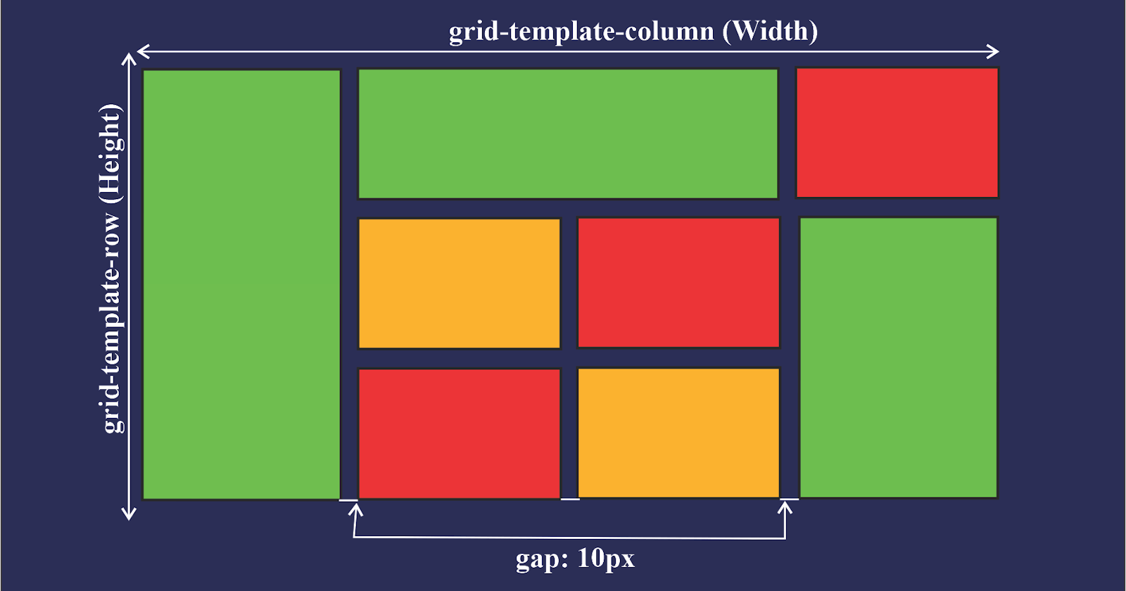


CSS Grid is a powerful layout system that allows you to create complex layouts with ease. It works by creating a grid of rows and columns that you can use to place and align elements on a web page. CSS Grid is particularly useful for creating responsive designs that look great on any device.
Here's an example of how to create a simple CSS Grid layout:
htmlCopy code<div class="grid-container">
  <div class="grid-item">Item 1</div>
  <div class="grid-item">Item 2</div>
  <div class="grid-item">Item 3</div>
  <div class="grid-item">Item 4</div>
  <div class="grid-item">Item 5</div>
  <div class="grid-item">Item 6</div>
</div>
cssCopy code.grid-container {
  display: grid;
  grid-template-columns: repeat(3, 1fr);
  grid-gap: 10px;
}

.grid-item {
  background-color: #eee;
  padding: 20px;
  text-align: center;
}
In this example, the grid-container element is set to display as a grid with three columns of equal width using the grid-template-columns property. The grid-gap property sets the spacing between the grid items. The grid-item elements are styled with a background color, padding, and center alignment.
You can also use CSS Grid to create more complex layouts, such as nested grids and grid areas. Here's an example of how to create a nested grid layout:
htmlCopy code<div class="grid-container">
  <div class="grid-item header">Header</div>
  <div class="grid-item main">
    <div class="subgrid">
      <div class="grid-item content">Content</div>
      <div class="grid-item sidebar">Sidebar</div>
    </div>
  </div>
  <div class="grid-item footer">Footer</div>
</div>
cssCopy code.grid-container {
  display: grid;
  grid-template-rows: auto 1fr auto;
  grid-template-columns: 1fr;
  height: 100vh;
}

.header {
  background-color: #eee;
  grid-row: 1;
}

.main {
  display: grid;
  grid-template-columns: 1fr 200px;
  grid-gap: 20px;
  padding: 20px;
}

.subgrid {
  display: grid;
  grid-template-rows: auto 1fr;
  grid-template-columns: 1fr;
  grid-gap: 20px;
}

.content {
  background-color: #eee;
}

.sidebar {
  background-color: #ccc;
}

.footer {
  background-color: #eee;
  grid-row: 3;
}
In this example, the grid-container element is set to display as a grid with three rows and one column using the grid-template-rows and grid-template-columns properties. The header and footer elements are placed in the first and third rows, respectively, using the grid-row property. The main element is set to display as a grid with two columns of equal width and a 20-pixel gap using the grid-template-columns and grid-gap properties. The content and sidebar elements are placed in the first and second rows of the subgrid using the grid-row property.
Here are some more examples of CSS Grid layouts that you can use as inspiration for your own projects:
- Magazine-style layout
htmlCopy code<div class="grid-container">
  <div class="header">Header</div>
  <div class="nav">Nav</div>
  <div class="main">
    <div class="article">Article 1</div>
    <div class="article">Article 2</div>
    <div class="article">Article 3</div>
  </div>
  <div class="aside">Aside</div>
  <div class="footer">Footer</div>
</div>
cssCopy code.grid-container {
  display: grid;
  grid-template-rows: auto auto 1fr auto;
  grid-template-columns: 1fr 3fr 1fr;
  grid-gap: 20px;
}

.header {
  grid-row: 1;
  grid-column: 1 / -1;
}

.nav {
  grid-row: 2;
  grid-column: 1;
}

.main {
  grid-row: 2;
  grid-column: 2;
  display: grid;
  grid-template-columns: repeat(auto-fit, minmax(300px, 1fr));
  grid-gap: 20px;
}

.article {
  background-color: #eee;
  padding: 20px;
}

.aside {
  grid-row: 2;
  grid-column: 3;
}

.footer {
  grid-row: 4;
  grid-column: 1 / -1;
}
This layout uses CSS Grid to create a magazine-style layout with a header, navigation, main content area with three articles, aside, and footer. The main content area uses the repeat and auto-fit functions to create a grid with a minimum width of 300 pixels and a maximum width of 1fr.
- Image gallery
htmlCopy code<div class="grid-container">
  <div class="header">Header</div>
  <div class="gallery">
    <img src="image-1.jpg">
    <img src="image-2.jpg">
    <img src="image-3.jpg">
    <img src="image-4.jpg">
    <img src="image-5.jpg">
    <img src="image-6.jpg">
  </div>
  <div class="footer">Footer</div>
</div>
cssCopy code.grid-container {
  display: grid;
  grid-template-rows: auto 1fr auto;
  grid-template-columns: 1fr;
  grid-gap: 20px;
}

.header {
  grid-row: 1;
}

.gallery {
  grid-row: 2;
  display: grid;
  grid-template-columns: repeat(auto-fit, minmax(200px, 1fr));
  grid-auto-rows: 200px;
  grid-gap: 20px;
}

.gallery img {
  width: 100%;
  height: 100%;
  object-fit: cover;
}

.footer {
  grid-row: 3;
}
This layout uses CSS Grid to create a responsive image gallery with a header and footer. The gallery uses the repeat and auto-fit functions to create a grid with a minimum width of 200 pixels and a maximum width of 1fr. The grid-auto-rows property sets the height of each row to 200 pixels, and the object-fit the property ensures that each image fills its container without being distorted.