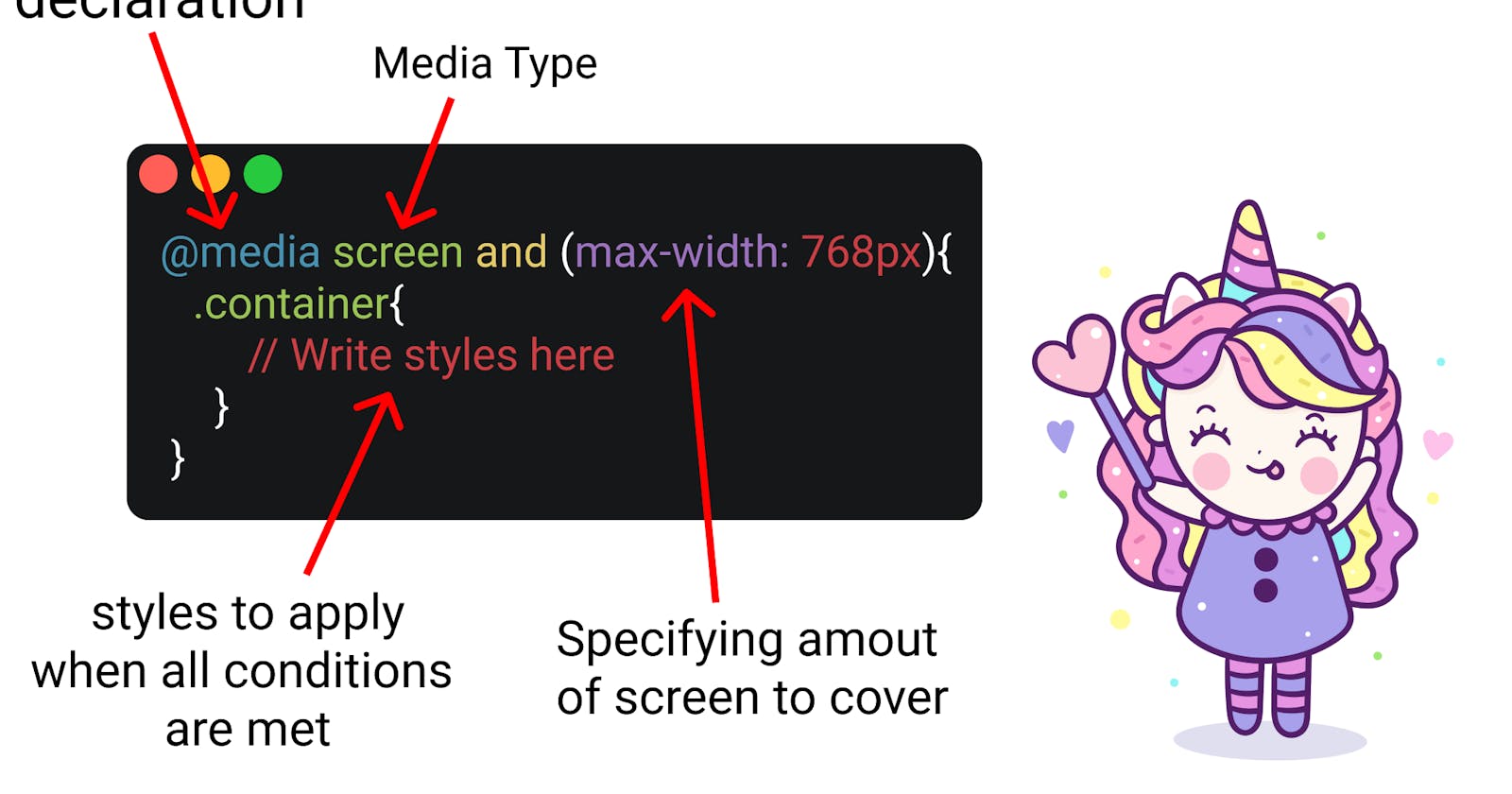


Media queries are a powerful tool in CSS that allows you to apply different styles based on the device or screen size. You can use media queries to target specific screen sizes, device types, and even specific features of the device such as orientation or pixel density.
Here's an example of how to use a media query to apply different styles to an element depending on the screen size:
htmlCopy code<div class="container">
  <h1>Heading</h1>
  <p>Some text</p>
</div>
cssCopy code.container {
  width: 100%;
}

@media (min-width: 768px) {
  .container {
    max-width: 960px;
    margin: 0 auto;
  }
}
In this example, the container element has a width of 100% by default. However, when the screen size is at least 768 pixels wide, the container element will have a maximum width of 960 pixels and a margin of 0 auto, which centers it on the page.
You can also use media queries to apply styles based on device orientation, pixel density, and even the type of device. Here's an example of how to use a media query to apply different styles based on the device type:
cssCopy code@media (min-width: 768px) and (orientation: landscape) {
  .container {
    padding: 50px;
  }
}

@media (max-width: 767px) and (orientation: portrait) {
  .container {
    padding: 20px;
  }
}
In this example, the first media query applies styles to the container element when the screen is at least 768 pixels wide and in landscape orientation, while the second media query applies styles when the screen is 767 pixels wide or less and in portrait orientation.
Hide or Show Elements: You can use media queries to hide or show elements on different screen sizes. For example, you might want to hide a sidebar on mobile devices and show it on larger screens.
cssCopy code.sidebar {
  display: block;
}

@media screen and (max-width: 767px) {
  .sidebar {
    display: none;
  }
}
In this example, the sidebar will be displayed on screens wider than 767 pixels, but hidden on screens 767 pixels or narrower.
Change Layout: You can use media queries to change the layout of your web page based on screen size. For example, you might want to change from a two-column layout on larger screens to a single-column layout on mobile devices.
cssCopy code.container {
  display: flex;
  flex-wrap: wrap;
}

.item {
  width: 50%;
}

@media screen and (max-width: 767px) {
  .item {
    width: 100%;
  }
}
In this example, the container element is set to display as a flex container with wrapped items, which creates a two-column layout. However, when the screen size is 767 pixels or less, the item elements will have a width of 100%, creating a single-column layout.
Change Typography: You can use media queries to change the typography of your web page based on screen size. For example, you might want to increase the font size on mobile devices to make the text easier to read.
cssCopy codebody {
  font-size: 16px;
}

@media screen and (max-width: 767px) {
  body {
    font-size: 18px;
  }
}
In this example, the font size is set to 16 pixels by default but increases to 18 pixels on screens 767 pixels or narrower. This can improve readability on smaller screens.
These are just a few examples of how you can use media queries to create responsive web designs. With some creativity and experimentation, you can use media queries to create layouts and designs that look great on any device.